
LOS ANGELES ZOO
Web Redesign
Project Overview
Project Brief
Intro
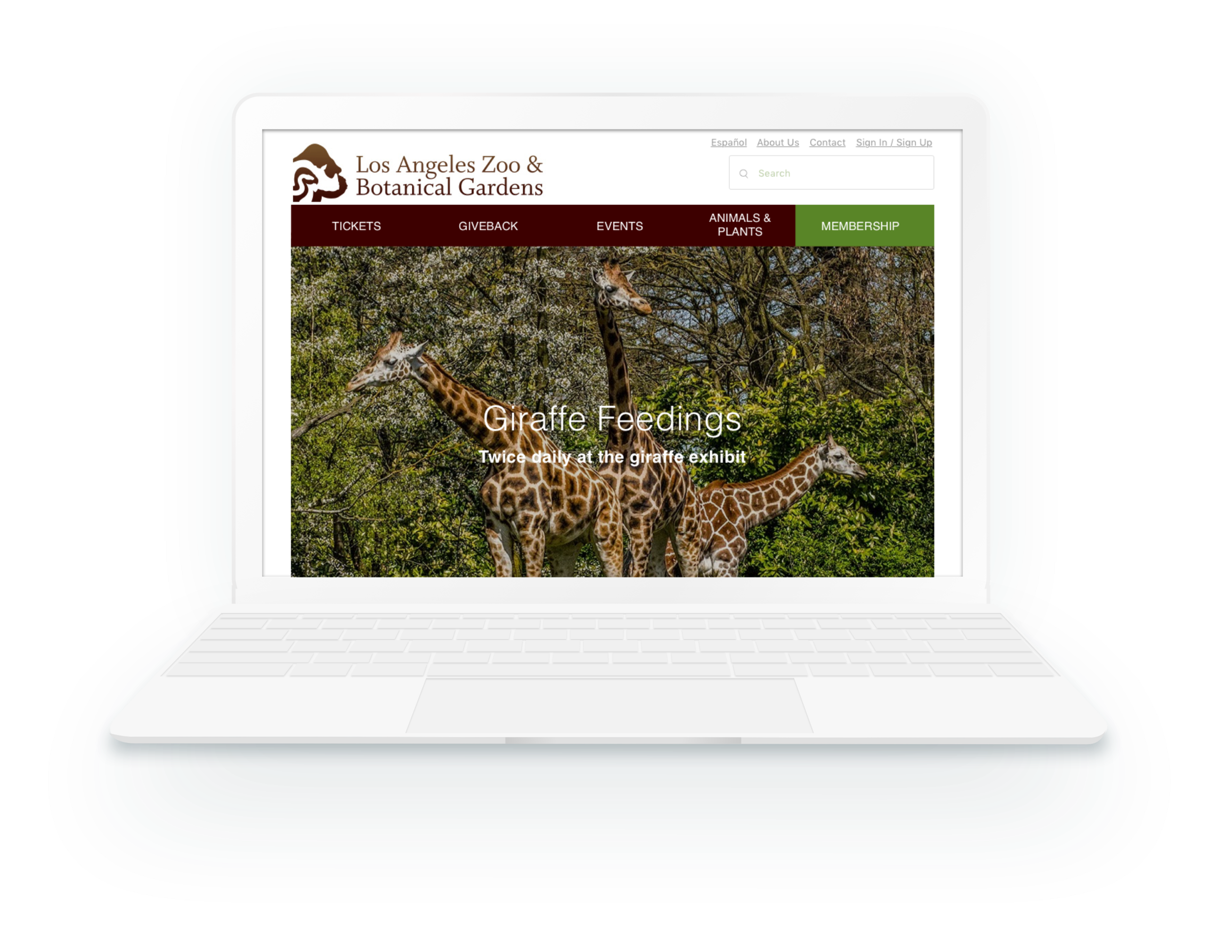
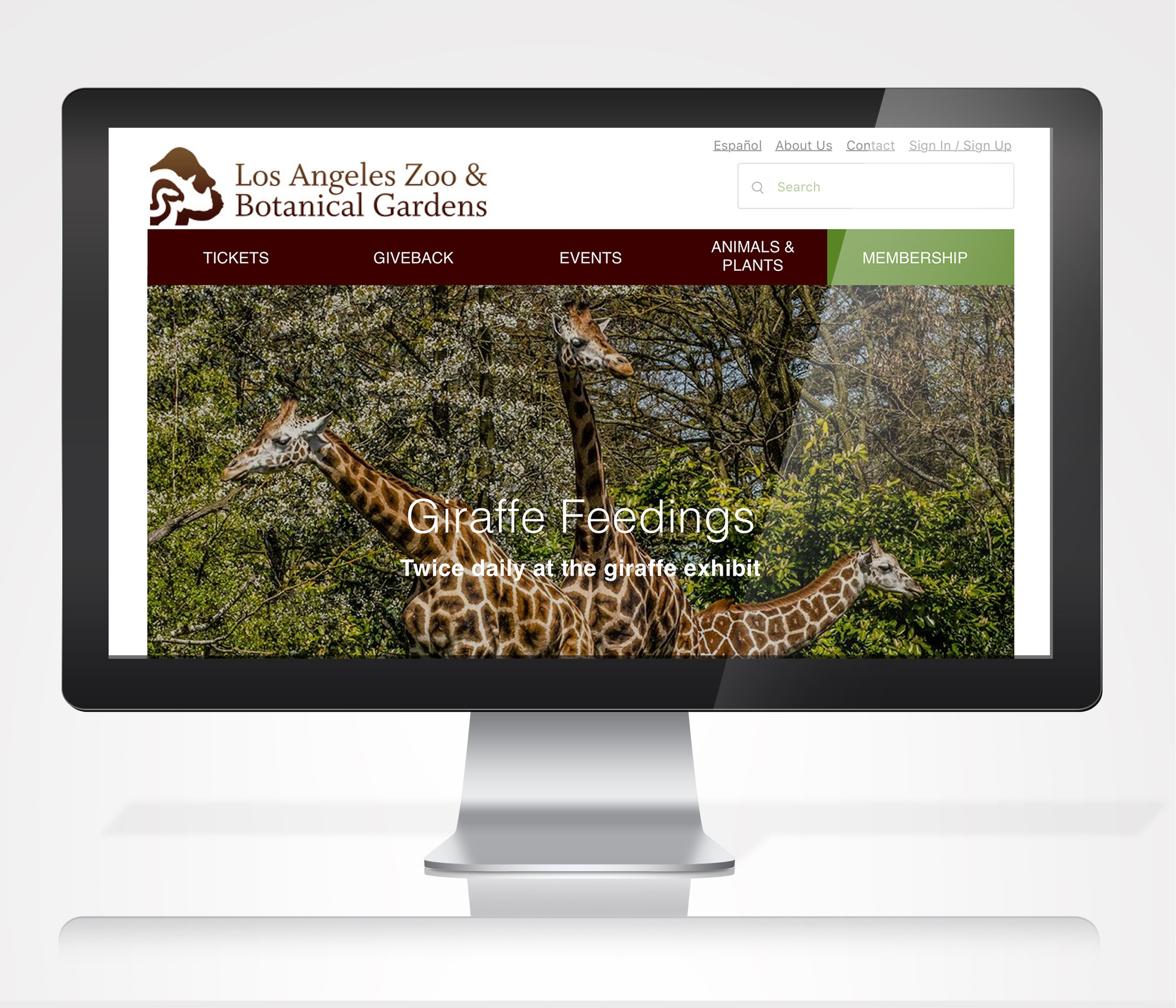
The Los Angeles Zoo and Botanical Gardens is home to more than 1,100 mammals, birds, amphibians and reptiles representing more than 250 different species, and receives nearly 1.8 million visitors per year and is owned.
Goals
Creating a more user friendly experience online to increase membership sign ups.
Target Audience
Families with 1+ children with an interest in animals, plants, science, and preservation efforts.
Time
2-4 Weeks
My Role
UX/UI Design
Tools
Sketch, Photoshop, RealtimeBoard, UXPressia, Keynote, Post-Its, Pen/Paper, InVision
Research
To further identify who are the main users and what improvements are needed to enhance their purchasing experience, interviews were conducted on top of Competitive & Comparative Analysis, and Proto-Persona.
Competitive & Comparative Analysis
By comparing LA Zoo membership page with competitors’ websites, I was able to identify features that can be incorporated into the redesign.
Los Angeles Zoo
San Diego Zoo
Aquarium of the Pacific
The Huntington
Design: 3.5/5
Usability: 3.5/5
Pros: Contains essential information.
Cons: Membership price not above the fold.
Design: 4.5/5
Usability: 4/5
Pros: Clear CTA above the fold. Compare and list button encourages users faster decision making.
Cons: Missing breadcrumb makes it hard for users to orient themselves.
Design: 4/5
Usability: 4/5
Pros: Clear CTA buttons above the fold on the right.
Cons: Use of UI elements needs improvement.
Design: 3.5/5
Usability: 3.5/5
Pros: Contextual Navigation on the left.
Cons: Poor readability and no clear CTA.
Proto-Persona
After conducting market research as well as user interviews on LA Zoo website performance regarding membership purchase and overall navigation experience, I have identified the target user proto-persona.

Scenario
He is comparing prices and finding best value family package for the upcoming family outing to the zoo. He is the head of the household with two children and the family visits LA Zoo once-twice a year.
Pain Points
• Current Global Navigation contains excessive information and is confusing to users
• Navigation system is missing which makes it hard to users to orient themselves
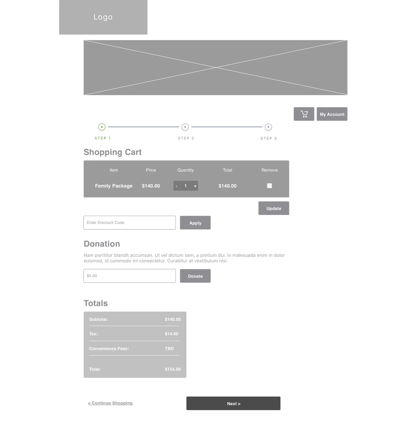
• Checkout process and the form is long and missing steppers
Information Architecture
Organizing content and giving the website a new structure with findings from research is crucial before entering the design phase. I used card sorting, site map, and affinity diagrams to help me prioritize features on the site.
Card Sorting
The results of open card sort (users encouraged to create their own categories) showed how people categorize items as well as the connection between them. I conducted total of two open card sort and one closed (pre-determined category) to help me identify the general pattern for global site navigation.

Site Map
To help me further rearrange and categorize the items nested in global navigation, I used site map to prioritize features that are most important and generate ideas on how to organize the information in design phase.
Design
I utilized findings from user research and results from information architecture to generate a new user flow, lo-fi wireframes, as well as hi-fi prototype.
User Flow
• Key: Blue = Start/End, Pink = Clicks, Green = Page
This user flow maximizes opportunities for users to access zoo membership page while reducing number of clicks it takes to as little as 4 to finish membership purchase.
Lo-Fi Wireframes
Using wireframes I was able to quickly generate ideas on what better enhance the user flow and at the same time ideating potential interactions and features that will help with overall navigation of the site.
• New homepage, member listing, and member detail page help users make quick buying decisions
• Check out process including stepper while removing global navigation will help focus users during transactions


Hi-Fi Prototype
With the Hi-Fi Prototype I was able to test it on users and get feedback for future iteration.